
By David Lin, Ph.D., Chief Science Officer, Global Footprint Network
This is part of the Ecobytes series where we explore interesting topics from Ecological Footprint and biocapacity data. Future installments will cover a wide range of topics. This first blog, sets the stage for all the fascinating data found in Global Footprint Network’s suite of data offerings.
Diving into resource trends
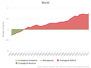
Our best resource accounting tells us that global ecological overshoot began in the early 1970s. That’s when humanity’s total demand for biological regeneration (we call this the Ecological Footprint) surpassed our planet’s biological capacity to regenerate resources (biocapacity).
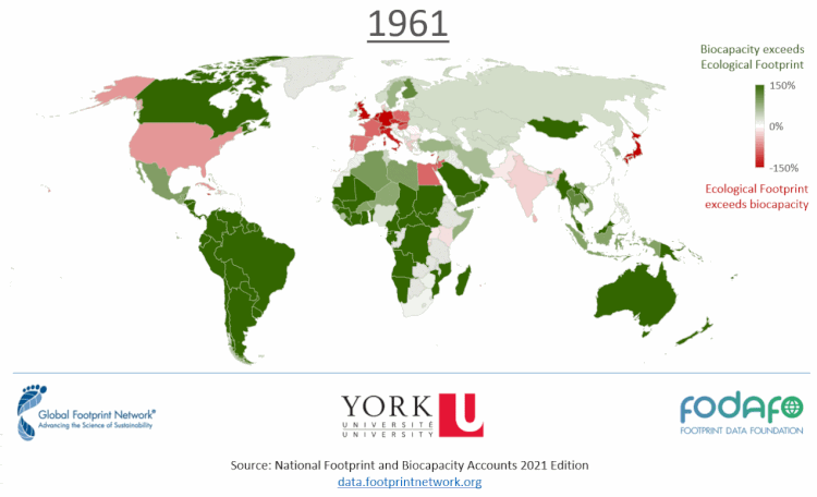
Diving deeper, let’s take a closer look at Ecological Footprint and biocapacity, but at the country level. Ecological Footprint is associated with the residents of a country, while biocapacity is associated with the country’s bioproductive surface areas. These areas include land, inland water, and marine areas that a country has rights to, or its exclusive economic zone (EEZ). In the map below—click it to see in animate from 1961 to 2017—countries in green run a biocapacity reserve; their residents consume less than their ecosystems can regenerate. Countries in red run a biocapacity deficit; their residents consume more resources than their ecosystems can regenerate.
Striking a balance between production and consumption
Can we conclude that countries in red are bad and countries in green are good? Or that red countries are destroying their environments by overharvesting or polluting? It isn’t that simple. Thinking of each country as a homestead, we can generalize that residents in red countries need to supplement their consumption with resources from outside their borders. We label these “purchases” as trade, and it isn’t a bad thing. For example, if the lemon tree on your homestead produces extra lemons this season, you can trade them with your neighbor for their eggs. If you live in the city and don’t have any productive land, trade allows you to buy both lemons and eggs even though you don’t produce either.
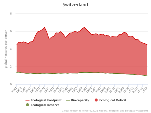
In Ecological Footprint and biocapacity accounting, being in the red doesn’t automatically mean that you’ve polluted or clearcut forests. For example, Switzerland runs a biocapacity deficit. The Swiss require roughly 4.5 times Switzerland’s biocapacity to support the consumption of Swiss residents. However, Switzerland is known for its beautiful Alps, fresh air, and clean water. Even though Switzerland runs a biocapacity deficit, the physical manifestation of environmental damage does not necessarily occur in Switzerland. The country and its residents can do this by purchasing goods from outside the Swiss borders instead of cutting down their trees and polluting their environment. This is trade. The global market allows us to trade goods and services in a way that optimizes the production and consumption of resources for everyone’s benefit (or at least this is the hope).
A planet of consumers
So, if it’s not trade, what’s the challenge? It would be problematic if the entire map was red and every country were net consumers. And herein lies the difference between biocapacity deficit and ecological overshoot. We don’t all live on bountiful lands overflowing with biocapacity that can provide for our material demands. Like the Swiss, countries that run biocapacity deficits can trade for goods from outside their borders. However, with ecological overshoot when humanity as a whole consumes more than Earth can regenerate, there isn’t a spare Earth with which we can trade our goods and services for additional resources. Our planet endures the physical manifestation of humanity’s environmental overuse through overharvesting forests and fish stocks, drawdown of soils, and accumulation of waste. As we continue to overconsume the biocapacity of our planet, the risk of more countries running a biocapacity deficit increases.
Let’s look at more data!
Tracking trade is key to understanding which countries are the ultimate producers and consumers of biocapacity. In order to achieve this, we use IO (input-output) data from our Ecological Footprint extended MRIO model, which can help us trace the flow of biocapacity through the global economy. Every single pair of countries in our database has an associated flow of biocapacity between them. One way to represent this overwhelming amount of data is by using a Sankey diagram. For example, the figure below shows the flow of crop biocapacity after all countries have been aggregated into continents.
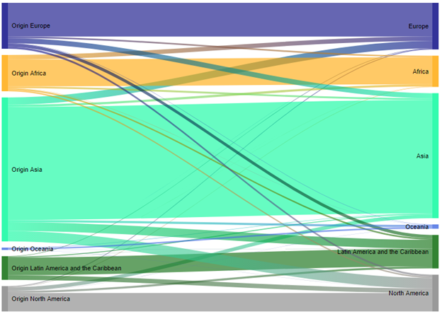
Link to online/interactive diagram
We’ve talked about global trade, as well as ecological deficits and reserves, but is there something analogous on a smaller scale? The reality is that for almost all people on earth, consumption and production are separate activities, and we think about our roles in terms of how much we consume every week. This is a great topic for another blog, and you can learn more about your personal Footprint with our online Footprint Calculator.
We hope you’ve enjoyed this dive into sustainability data. Keep an eye out for our next Ecobytes blog post, where we’ll explore beef from Brazil: How many cattle are raised around the world annually to feed everyone, and how does this production affect the environment of the producing countries? Stay tuned!